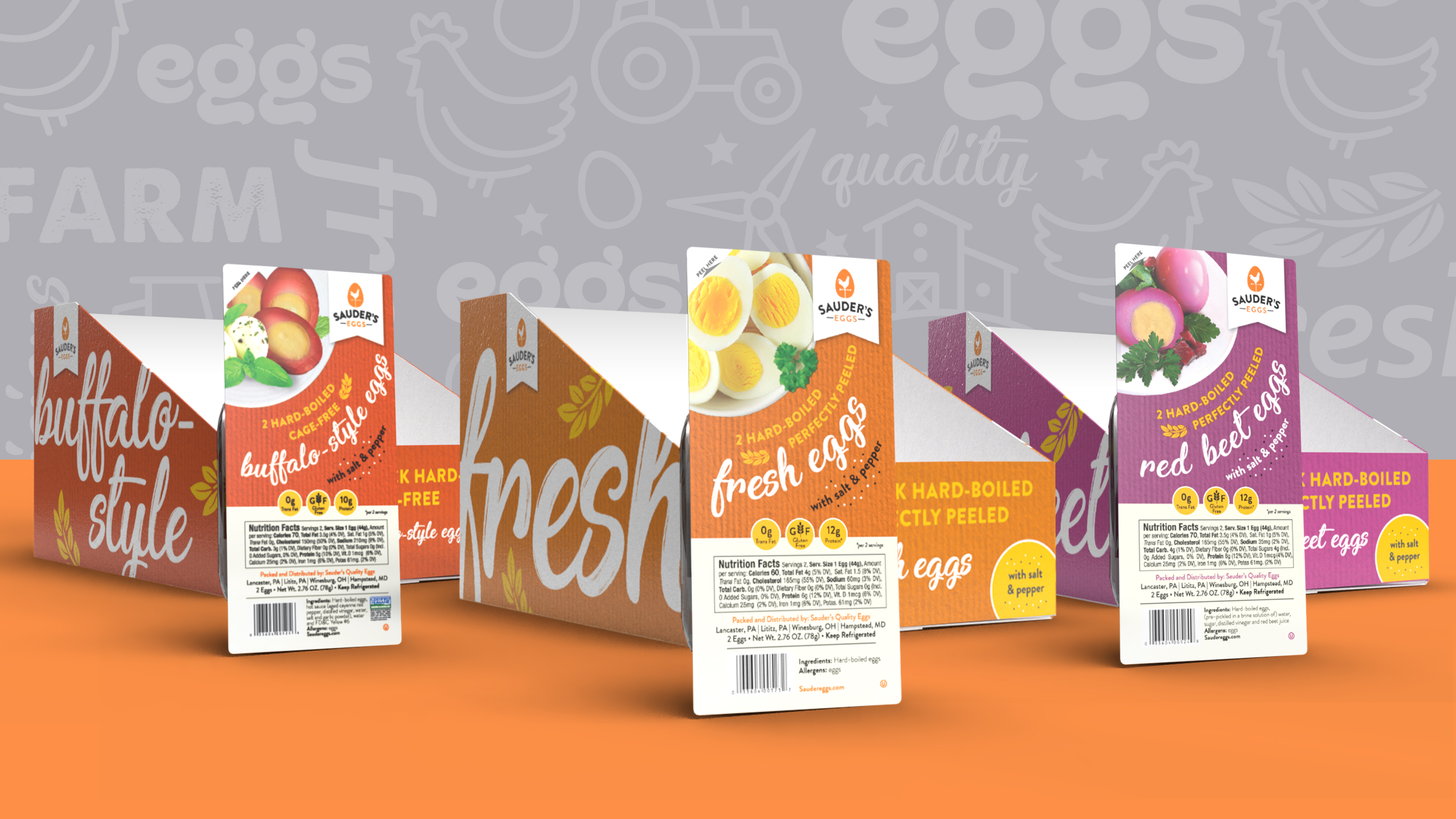
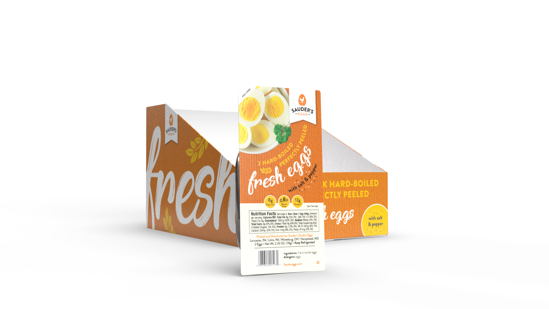
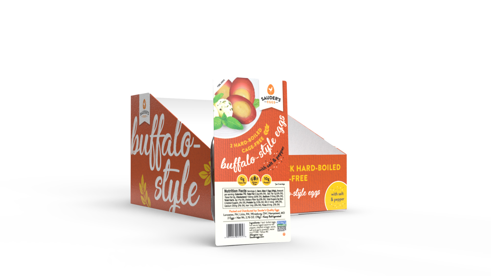
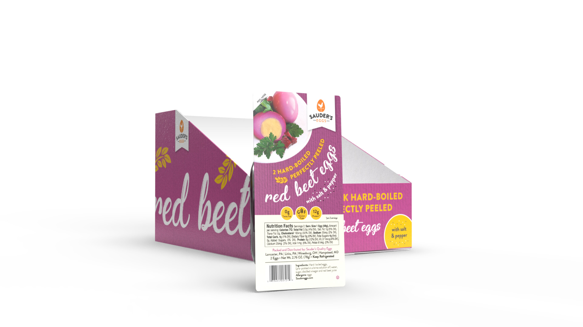
Packaging created for Sauder’s hard-boiled 2 pack eggs and their display cases. The packaging included Regular, Red Beet and Buffalo-Style flavors. The goal was to create a bold, fresh look for an existing brand which would be eye-catching and stand out from the rest of the packaging on the shelves. The goal was achieved by using bright, bold colors specific to each flavor for easier identification by the consumer. Hand-written type was used in order to create a warm and inviting look with a human element. Product photography was anchored in the upper left corner with the typography following the path of the circular plate.
The same look was carried through to the display cases, with large cropped typography being the focus of the side of the carton. The idea was to make it as easy as possible for the consumer to recognize the flavor of the eggs inside the display case.
***
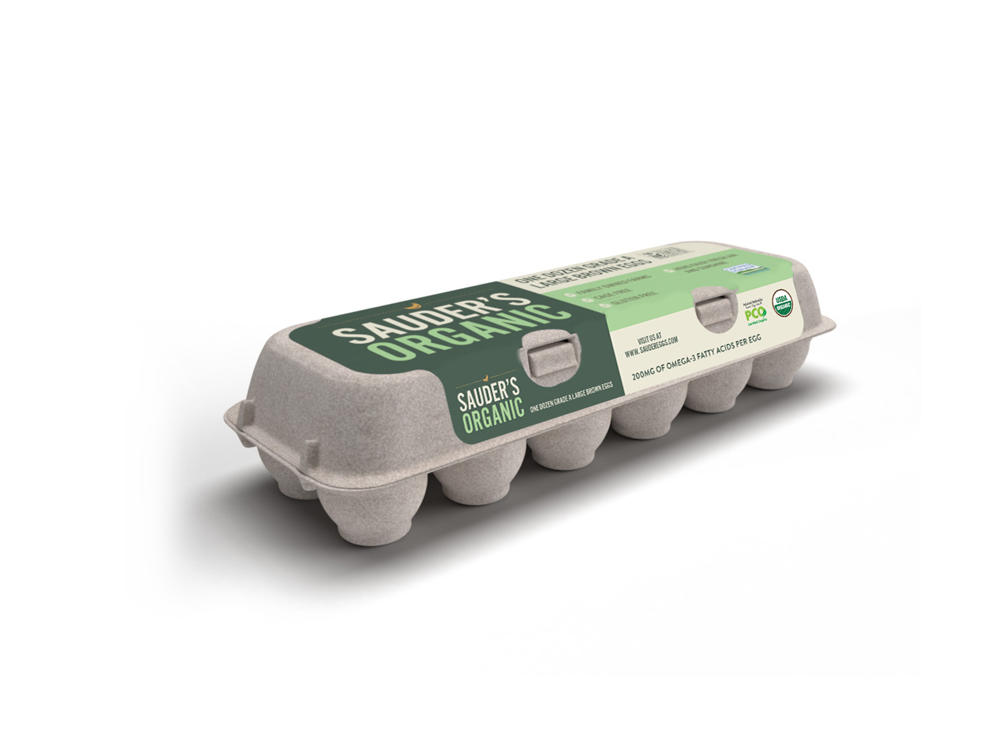
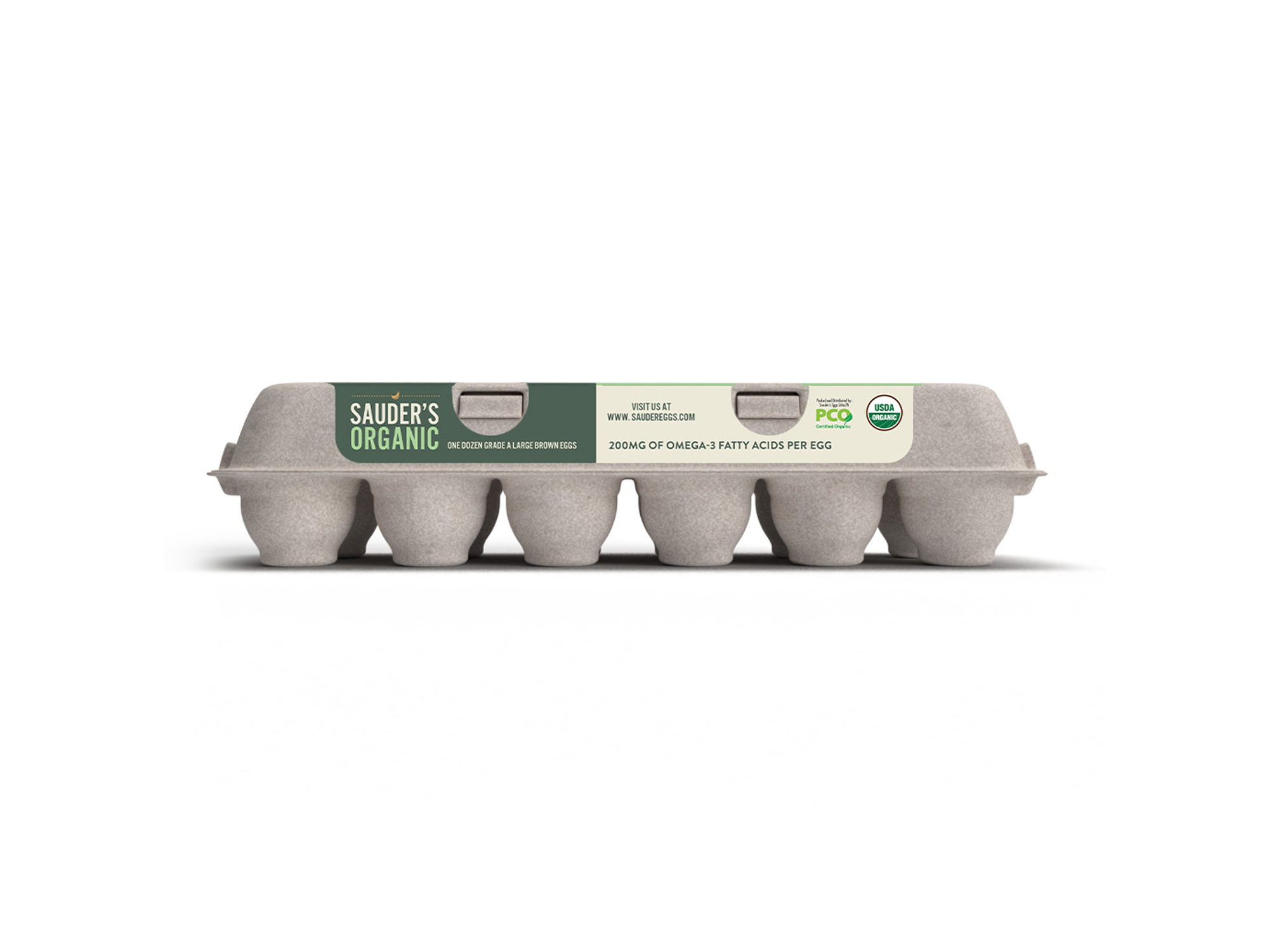
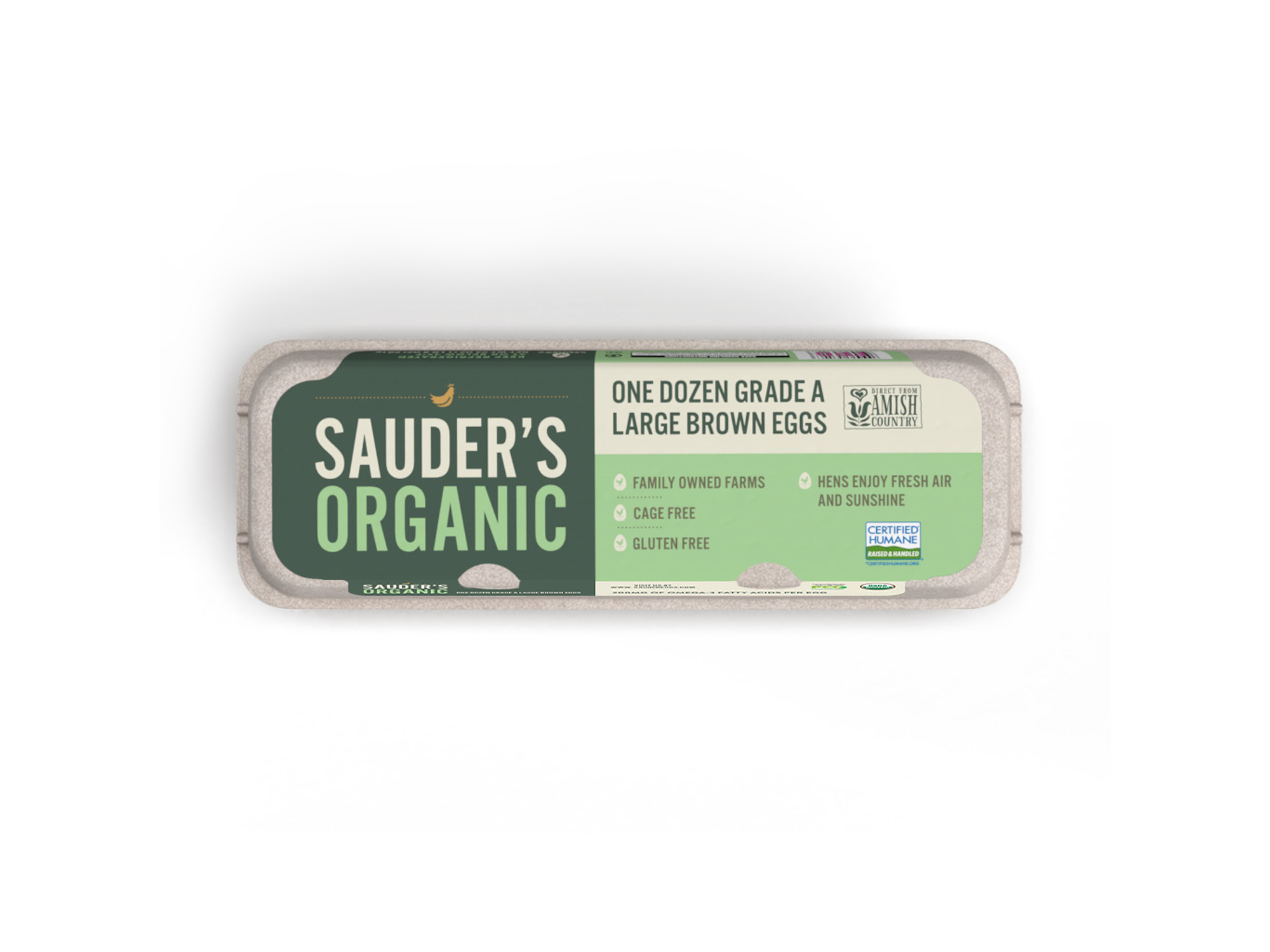
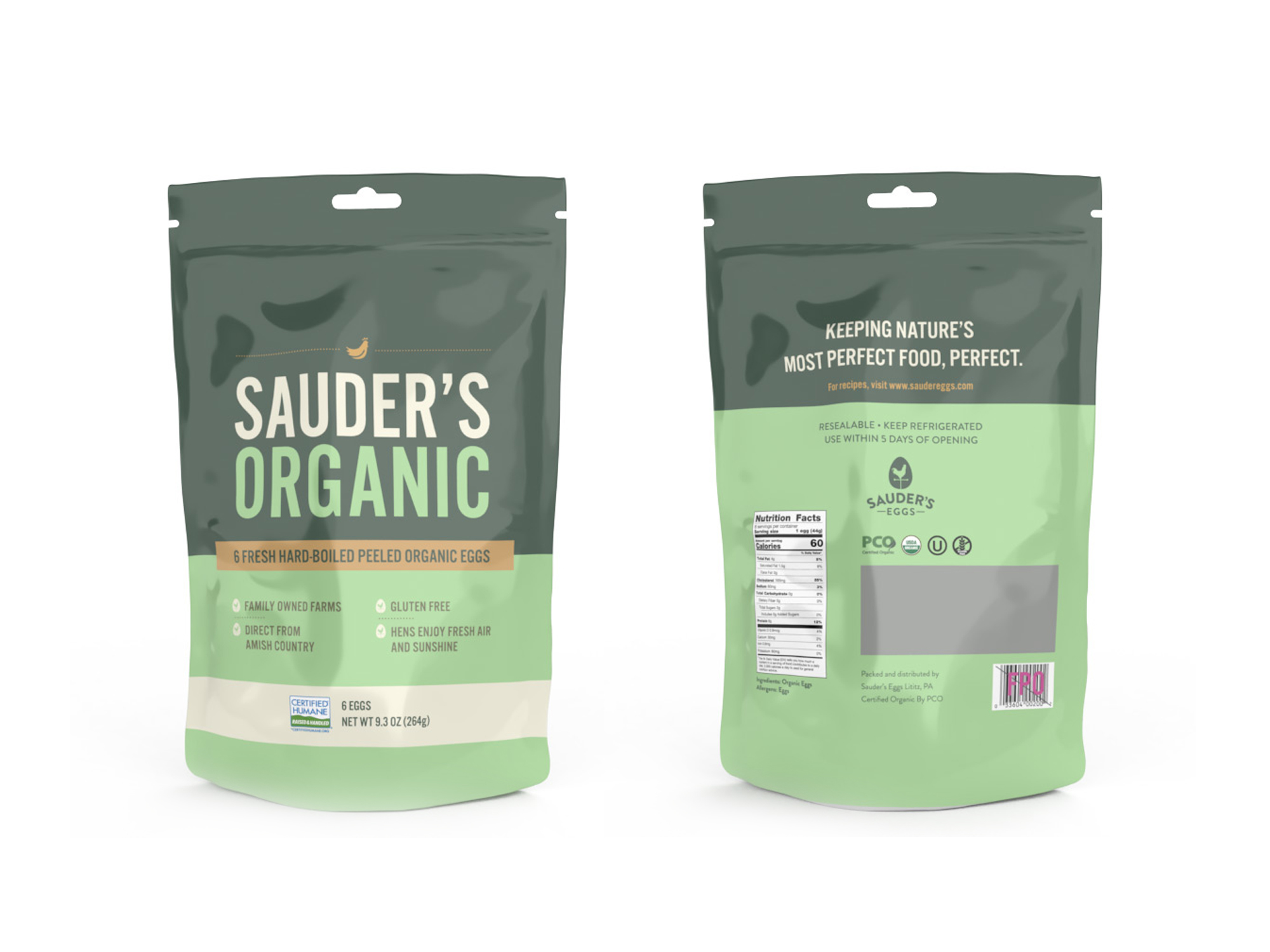
Also shown here is the Sauder’s Organic line which includes the large brown eggs carton as well as the hard-boiled organic egg pouch. The goal here was to step outside the regular branding and create a unique, high-end product that was friendly and inviting, yet sophisticated. The green and beige palette speaks to the product being healthy and organic.
This work is a product of the relationship between Sauder’s Eggs and Merz Branding.