![]()


Acenda is a nonprofit organization that provides life-enhancing programs and services to individuals, families, and communities across ten counties in New Jersey. The goal was to create branding for the organization that was emotive, welcoming and empowering. It needed to deliver the mission and vision of the organization in a clean, modern and professional way while maintaining a friendly and uplifting look and feel.
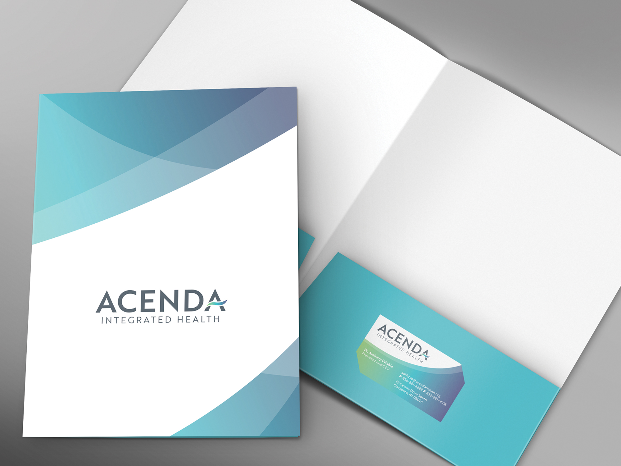
The goal was achieved by using a strong sans-serif font and a bold grey color paired with a soft swoosh in the letter ‘A’ to represent lifting someone up and ascending. The gradient in the swoosh is made up of several colors to represent the wide range of people served by the organization.
The branding is carried through to the brochure, folder and stationery by using the same angles from the swoosh to display photos, text and a background pattern. The pattern is made of overlapping transparent shapes to evoke a feeling of energy and positivity.
This work is a product of the relationship between ACENDA and Merz Branding.